
Fonts
Fonts and typography play an important role in communicating the right tone, personality or idea of our brand to our audience.
Download information for each font and free Google font alternative is available.
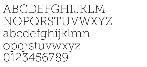
Museo Slab
Museo Slab can be used for:
- Headlines
- body copy larger than 10 points
Downloads and Alternatives
If you use Adobe Creative Cloud, Museo Slab can be downloaded for free.
Roboto Slab is Idaho State’s approved Museo Slab replacement font.
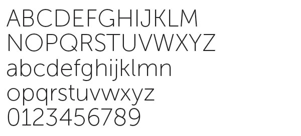
Museo Sans
Museo Sans can be used for:
- Subheadlines
- Copy smaller than 10 points
- Large amounts of copy
Museo Sans is the clean, pure sans-serif counterpart to Museo Slab.
Downloads and Alternatives
If you use Adobe Creative Cloud, Museo Sans can be downloaded for free.
Roboto is Idaho State’s approved Museo Sans replacement font.
Museo
Museo can be used for:
- Headlines
- Shorter amounts of copy
Museo falls between Museo Slab and Museo Sans in style.

Downloads and Alternatives
If you use Adobe Creative Cloud, Museo can be downloaded for free.
Roboto is Idaho State’s approved Museo replacement font.
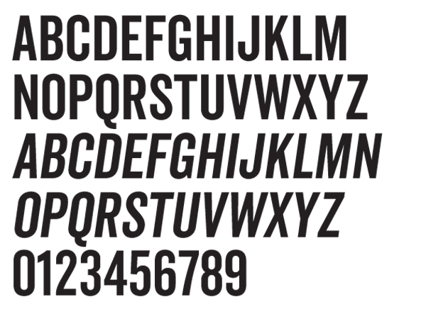
Veneer Clean
Veneer Clean can be used for:
- Headlines
- Simple, singular, bold statements which need to stand out
Veneer Clean Italics is the font used for the ROAR campaign. It should be used sparingly.
Downloads and Alternatives
There is a cost to download Veneer Clean.
Roboto Condensed is Idaho State’s approved Veneer Clean replacement font.
Accessible Text
Text should always be formatted with accessibility in mind whether you're creating digital or print content. The following guidance is applicable to all applications.
Font Choices & Styling
Hierarchy:
When working with text, consider the inverted pyramid not just in the way information is shared, but how it’s formatted. This concept places the most important information at the top, with less important information shifting toward the bottom. This same idea can be applied to the visual styling of text elements within your piece.
- Structure and design content logically so that visuals don’t compete for order of visibility. The most important information should be the largest, and supplemental information should be smaller.
- Use Main Headers, Section Headers, Subtopic Headers, and Body Copy- use text styles to accomplish this hierarchy in visual design. For example:
H1: Main Header
H2: Section Header
H3: SUBTOPIC HEADER
Body (Paragraph): Supporting Copy
Styling:
- 12 - 18 point is easier to read, anything smaller than 12 points should be avoided
- H1 headings should be 32 - 44 points
- Avoid placing text against textured or busy backgrounds that hinder readability
- Use a limited number of fonts on one page
- Sans Serif are more readable
- Museo and Museo slab should be used on a limited basis
- Extra thin or extra bold or italicized fonts can be difficult to read
- Use bolding to emphasize words or short passages only
- Avoid hyphens
- Avoid all caps
- All caps should be limited to short headings on a limited basis
- Avoid italics
- Unless used sparingly to call out short headings or phrases. Creating visual hierarchy on the page.
- Avoid increasing the kerning between letters, utilize the automatic kerning for the font you’re using
- Can be used sparingly on one to two words, but the space should not be so large that it’s difficult to read.
- Limit reverse type or “knock out” text (light text on a dark background). If used, try to use a more bold font for increased visibility
Alignment:
- Left alignment is the easiest to read
- Don’t use center or right aligned
- Full justification can cause uneven spacing between words
- Utilize columns when possible rather than margin to margin text, it’s easier to track the lines when they are shorter. Lines longer than six inches are too hard to track. Make sure column spacing is at least .5”.
- Vertical or angled text should be avoided unless it is decorative or used for short words or phrases.
- Leading- 1.5x - 2x the font size (ex. 1.5 line spacing when using a 12 point font is 18 points leading)
| Font Size (in points) | Leading (in points) |
|---|---|
| 12 pts | 18-24 pts |
| 14 pts | 21-28 pts |
| 16 pts | 24-32 pts |
| 18 pts | 27-36 pts |
Font Color Contrast
Per Web Content Accessibility Guidelines (WCAG), a minimum color contrast ratio of 4.5:1 for normal sized text (12 - 14 points) and 3:1 for large text (14 points bold or 18 points and up) is required for legibility by users with visual impairments. Review our color contrast guidance to ensure you’re choosing text and background color combinations that meet accessibility standards.